PharmaForce

Task

Create a new Marketing Strategy and Advertising look and feel for PharmaForce. Creative application to Social media posts and events on Fb, Ig and WhatsApp as well as roll-out of new concept to Presentations and Print Ads.

  • Strategy

    Art Direction, Brand Development & Collateral, Packaging

  • Design

    UI/UX Design, Art Direction

  • Client

    PharmForce

  • Industry

    Medicine, Pharmaceuticals

how it’s made

PharmaForce
Identity

PharmaForce, a Crossome Brand (branding also done by Fuge), wanted an Identity that tells a story. Their company vision was to provide medicine that will impact lives for better living. This was all the info Fuge needed to create a simple yet telling Identity. A heptagon was the perfect shape as each of the corners could represent the 7 pillars of life. By cutting into this shape, we illustrated how PharmaForce impacts life.

Brand collateral

Creating internal
Brand loyalty

PharmaForce’s management team immediately responded positively to their new Identity and wanted their staff to feel the excitement through all their Brand collateral. Fuge designed all stationary (Business cards, Letterheads and Email signatures) as well as their Powerpoint templates. We also introduced a look for their photography use which emphasised their Story: PharmaForce produces natural and allopathic quality medicine for people from all walks of life to truly enhance their overall health and long-term wellness.

how it’s made

Product
development

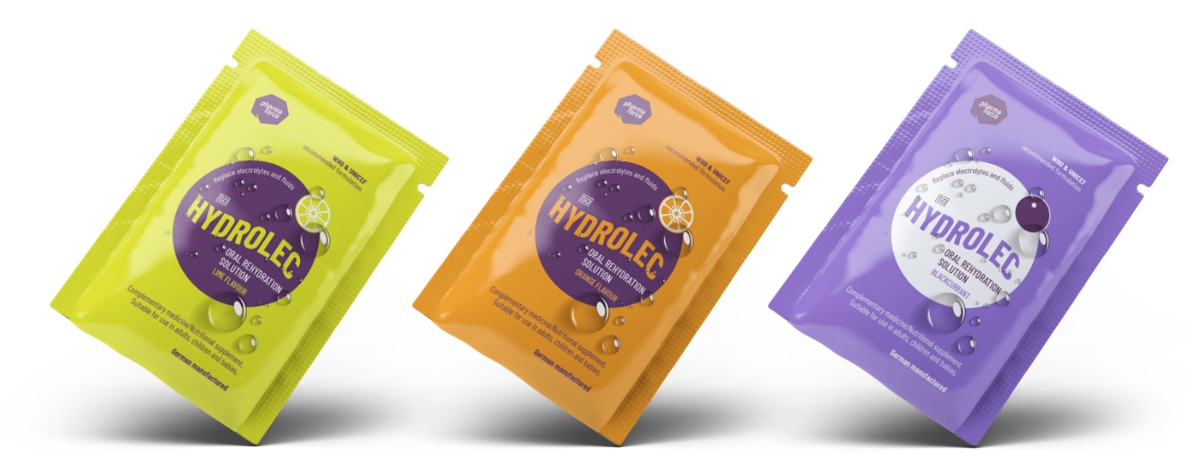
Although PharmaForce has a range of existing products, they are developing their own range, the first – an electrolyte replacement – Hydrolec.

Due to the vast competitor list in the South African market with a specific one having monopoly, Fuge suggested neon colours so the packaging jumps off the shelf. The design is modern, simplistic, fun and energetic.